Why are so many websites just plain ugly?
Awkward stock photos of people in grey pinstriped suits shaking hands and menus with endless amount of pages and subpages like a virtual, headache-inducing corn maze shouldn’t still be a thing in 2018.
Right?
At Boss Brands, we’re obsessed with websites that are clean, modern and easy to read. A solidly good website makes you look good, your services easy-to-comprehend and your potential customers ready to take the next step.
Here’s how to get that boss website you deserve:*
1. A homepage that makes a strong first impression.
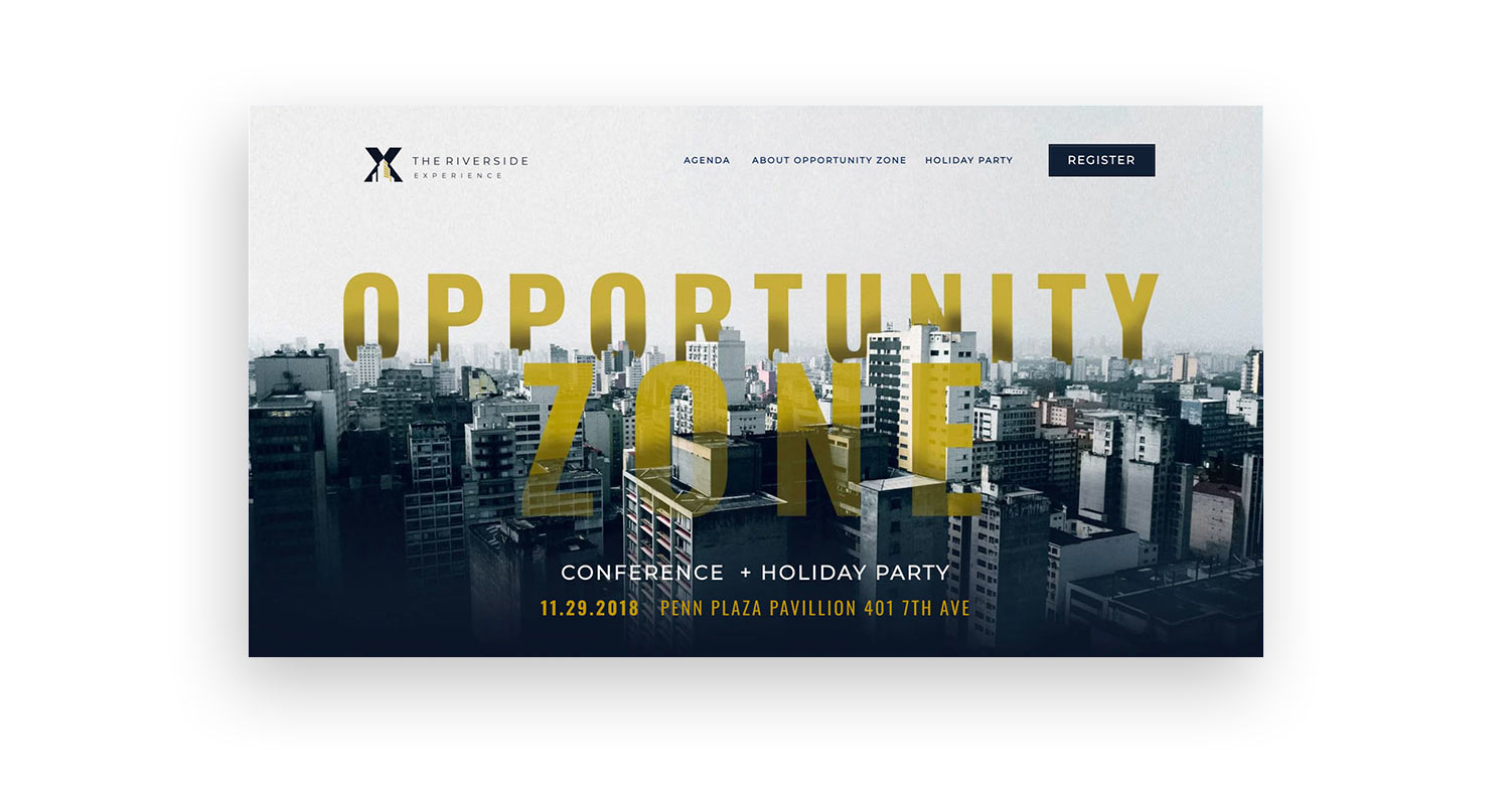
The screenshot above has a strong tagline followed by a short company descriptor. Notice how comprehensive all elements on the page are and how well they work with each other. The first impression is powerful simply because there are so few elements and each one is so well thought out.
- Introduce yourself with a large header line followed by a shorter heading (up to two sentences) to tell people what you do, for whom, and how you’re unique.
- Integrate it with a bold, eye-catching image that relates to your service, audience and overall tone of your brand and corresponds with the header line and shorter heading to follow.
- Stay succinct; you only have 20 seconds to make that killer impression or your user will bounce off to social media land.
2. Menu Manners.
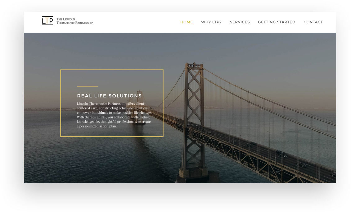
Notice in the screenshot above how we chose not to make each service its own main menu item, but instead hid them below services. Not only does it make the menu simpler and easier to spot other important menu items, it also makes it easier to find the company services right away. A visitor would most likely be searching for the word “services” to see what they offer rather than for a specific treatment type.
- Opt for a clear menu – one that’s organized and in an intuitive spot to find on the home page.
- Limit yourself to up to six page options on the menu to limit overwhelm for your user. If you can’t, consider using a dropdown menu.
- Give your pages simple and obvious names in your menu for easy navigation.
- Think carefully about what pages your visitors might want to get to and organize the menu accordingly. If your visitors are looking for staff listings, make sure the name of the page is called “staff” and make sure it is either a main menu option or if it’s in a dropdown, that its under an intuitive parent menu like “Our Company” or “About Us”.
3. Solid ‘call to action’ buttons.
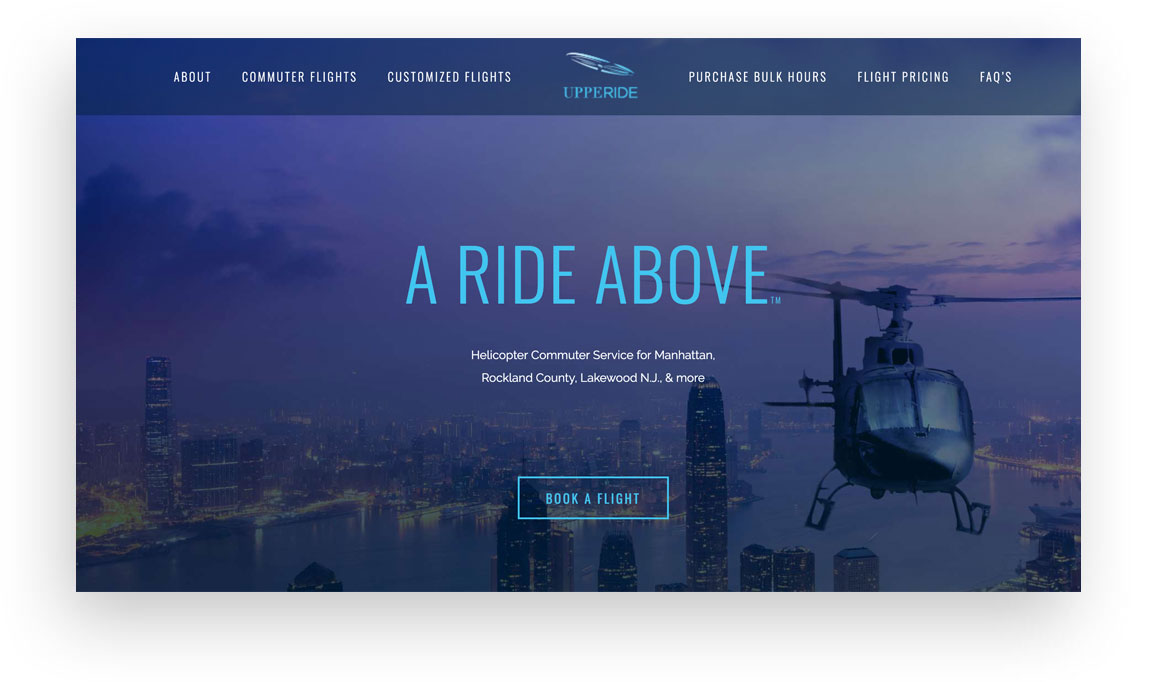
This website has a call to action section below the main homepage image. Here it goes a bit further in depth about what the company offers as well as presenting a strong call to action (book a flight)
- Your website visitors need clear direction so go ahead and guide them using clearly labeled buttons to get them to take the next step.
- Think from visitors perspective – what call to action would they want to see? What do they want to gain from your site?
- Get creative with your wording on your call to actions and encourage your buyer to do more than just ‘buy now’. Use exciting, engaging words like ‘join’, ‘learn’, ‘explore’, ‘discover’, ‘get started’, or ‘sign up’.
4. Good design (duh).
Imaging:
If you don’t have professional photos of your products or business, try to find the highest quality stock photos you can. And keep in mind, a good stock photo won’t look like a stock photo. Use imagery that is fresh, contemporary and not overly busy to create a bold, clean look for your site. We advise using a site like pexels.com to find stock photos that are royalty free and actually good looking.
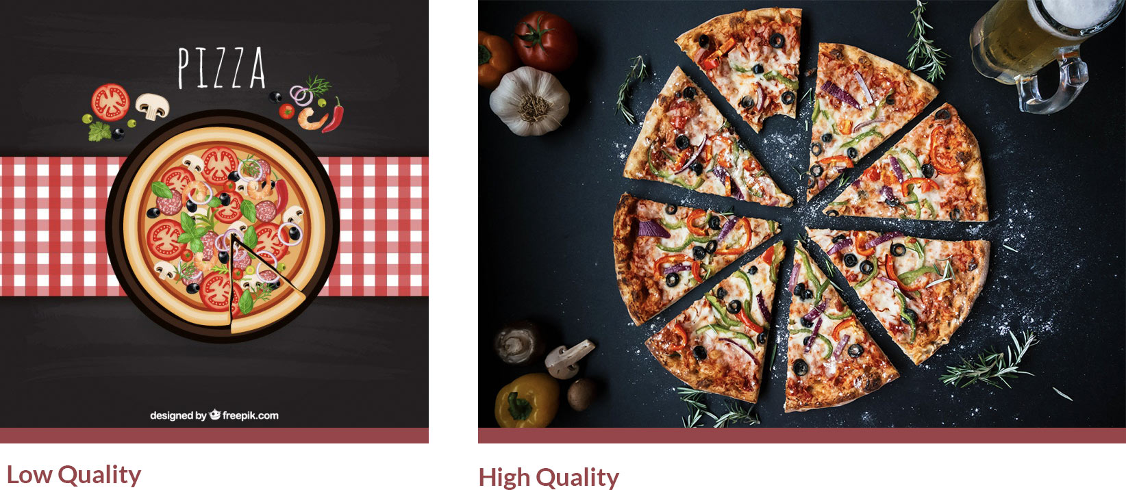
In the above examples, the low quality image is an amateur illustration that doesn’t have that expensive rustic appeal like the high quality image on the right. Both these images were free (Freepik.com and Pexels.com)

Though the photography on both these images is clearly professional, the perspective makes all the difference. The low quality photo is “fake” looking with unnatural smiles and a light beam give off that cheap feeling of a generic website. The high quality image has a modern flat lay style view that hints to a business deal without being overly obvious.
Typography:
Choose your typeface (a fancy word for fonts) carefully with fonts that are professional and unfussy. Clean, simple fonts are easier to read online and you want everything to be legible. When you add your text, you should consider additional type styling like: Letter spacing, (space between letters) Line height, (space between lines) and Case (uppercase and lowercase). These seemingly minor attributes have a strong effect on the overall quality of the site’s design.
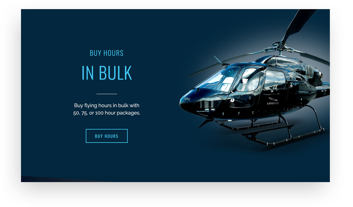
In this example, the words “Buy hours in bulk” are in all capitals (google font Oswald) with a letter spacing of 10 em while the white text is a basic sans-serif font (google font Raleway) in sentence case with 0 letter spacing.
5. Good copywriting is crucial.
- Keep it simple with your content and don’t overwhelm visitors with every testimonial, project, service and detail of your company’s history. Just an easy-to-read site with the basics of what you do, how you set yourself apart from the competition and how to get in touch with you. Answering frequently asked questions or hesitations is also a good idea. Cramming too much text and content will typically have an undesired effect and give off an unprofessional, messy impression.
- Don’t try to impress anyone with long words or fancy jargon. Write in simple, easy-to-understand language that can be skimmed by a rushed reader. When in doubt, leave it out; opt for more images and less text .
*it’s not even optional to have a mobile optimized and SEO friendly site in the 21st century so don’t make us even go there and explain why you need that.
Recent Works


Get Social